Tile: release notes
Tile is an experimental image editor that lets you layout images using a tiling tree layout. You can move, split, and resize images using keyboard controls.
Motivation
1. Tiling window managers
I’ve been using the tiling window mananger i3wm for around six months now. For my purposes, tiling windows are a much better and more intuitive experience than the dominant “floating windows” desktop metaphor. A big part of the motivation for making tile was wanting to dive in and explore how tiling logic works at the code level.
2. Dividing up space from the outside in
In Tile (and i3wm) you divide up space from the outside in. You start from the window size, then you portion it up. It reminds me of folding a paper into sections. This is a different way of thinking about layout than I’m used to, though it’s hard to articulate exactly why. People may have recently become more familiar with tiling layouts from seeing them in Zoom video layouts.
Proportional splitting is built into web layout in the form of percentage units and the newer viewport units. CSS Grid also has you specify how to split up space. I think tiling feels different to me because the splitting up of space is the primary interaction, and you can do the splitting up incrementally with immediate feedback: “first let’s split this, ok and now this section, now let’s stop and take a look.” Even with CSS grid I feel more like I’m building from the inside out.
The feel of tiling
The main benefit of tiling is that it uses all the available screen space. In all of the Constraint Systems experiments I’m interested in trying to go “with the grain” of the computer. Tiling works off the screen as the space of possibility, and encourages you to act within it. The tiles in a tiling window manager are like additional screens (the recursive nature of it feels very computer-y to me): here is a rectangular area that you can fill with programs as you see fit (as they fit).
A lot of designs make use of an “offscreen” metaphor borrowed from the physical world, where you can swipe to see different applications. Mobile design is full of these. I think the offscreen metaphor can be useful. But I think it’s also useful to go the other direction and not pretend. In i3wm you have multiple desktop spaces, but (by default) there’s no swiping transitions between them. Each numbered workspace is just a space that can be immediately switched to, the same goes for the applications within the space. For me, it makes the computer feel more tool-like. I feel like we have a more honest relationship. An additional benefit, is that because there are no complex transitions you aren’t distracted by the occasional transition failure or interruption.
Stumbling blocks: the tree
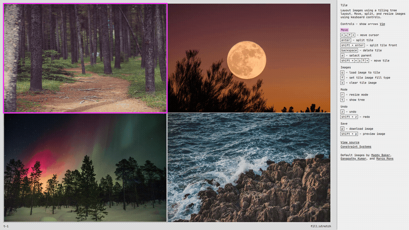
I find the initial divvying up of a tiling layout to be pretty intuitive. It is making changes to that initial layout that can be confusing. The reason for this confusion is the tree data structure that underlies layout. Specifically, it is the discrepancy between the actual layout structure and how that structure appears on the screen: sometimes movements that look like they should behave the same act differently due to the underlying structure. The easiest way to demonstrate this is looking at a layout split into four equal sections:
The quad dilemma
How a tile can be moved depends on its relationship to its parent container.
Let’s look at an example where the layout has been split into four equal sections, the underlying tree structure for this layout is:
- Root - horizontal layout
  - Container 1 - vertical layout
    - Tile 1
    - Tile 2
  - Container 2 - vertical layout
    - Tile 3
    - Tile 4
In tile (as in i3wm) you can move existing tiles using shift and the arrow keys. If you want to swap Tile 1 and Tile 2 you can move Tile 1 with shift + ↓ for a swap. The issue comes when you want to swap Tile 1 and Tile 3. It looks like you should just be able to move Tile 1 with shift + → and swap it with Tile 3, but because of the tree data structure (and choices I made in the movement logic), the first movement changes the orientation of the Container 1 split, pressing it again moves it out of Container 1, resulting in:
- Root - horizontal layout
  - Tile 1
  - Tile 2
  - Container 2 - vertical layout
    - Tile 3
    - Tile 4
Tile 3 has popped out of Container 1 and now you have a three across horizontal layout. If you press shift + → again you are presented with a choice, do you want to move Tile 1 next to Tile 3 or Tile 4? Choosing Tile 3 results in this structure:
- Root - horizontal layout
  - Tile 2
  - Container 2 - vertical layout
    - Container 3 - horizontal layout
      - Tile 1
      - Tile 3
    - Tile 4
To achieve the original swap you can move the cursor to Tile 3 and repeat the steps in reverse (press shift + ← several times). Until you achieve the swap:
- Root - horizontal layout
  - Container 4 - vertical layout
    - Tile 3
    - Tile 2
  - Container 2 -vertical layout
    - Tile 1
    - Tile 4
So a swap in the vertical rejection requires only one keypress, while a horizontal swap requires 8+. The reason for the difference is “logical” in that it reflects the underlying tree data structure. I try to give a hint about that structure by giving the parent container a wider gray background in Tile. It helps as a hint, but the movement effects can still surprise you if you don’t have the structure in mind. I think this unpredictable movement is the biggest obstacle in getting used to a tiling layout. I tried some strategies to overcome it in Tile. I believe those strategies help but I still wonder if there isn’t some other solution that could make things even more intuitive.
Why does it have to be a tree?
If the mismatch between the tree layout and the user’s mental model is the major stumbling block in moving and changing content in a tile layout can we switch out the tree structure? I thought hard about this for a while, and my conclusion was… no. I’d certainly be interested to see any tiling layout experiments that use a different structure (some tiling window managers do use a “list” structure instead, where the layout is almost completely automated, but I wanted something where you could manually adjust the layout).
The tree structure also determines how a tile can be resized. It ensures that there are no gaps between tiles.
So what does a tree layout get us and why is it hard to replace? The simplest example I came up with to demonstrate its value is resizing children. Like moving a tile, resizing acts differently depending upon the relationship of the tile to the parent. If we look at the same quad again, we see that if you resize vertically it behaves as you would expect, the selected tile takes space from its vertical neighbor. If you resize horizontally, because the parent is vertical, it resizes the parent, taking space from the neighboring horizontal parent.
What if the tiles weren’t constrained by the relationship to parents. You could imagine that resizing horizontally would instead act the same as vertically, taking space only from the neighboring tile. I’m not sure exactly how that data structure would work, maybe instead of reworking the data structure you’d just change the resize logic, so that operated more like collision detection on whatever was visually near. But here’s the conceptual issue I ran into: Say you resize Tile 1 so it is vertically shorter, than you make it wider, if you try and go tile by tile, it would push only the horizontally neighboring tile and you would be left with a gap in the middle, between the bottom right corner of Tile 1 and Tile 4 below it. The tree parent relationship ensures these gaps don’t exist, and that is why it is necessary, even if it causes issues with our mental models.
(I do still wonder if you could do something like a tree layout that reconfigured on the fly. Where it looked at the visual arrangement, and if it was such that it wouldn’t cause a gap, it would modify the structure so that resizing would perform more like you visually expect. There would be ‘tracks’ that resize could travel along. I still haven’t decided if that approach is really viable, it would, at the least, require a lot of edge-case handling.)
My movement philosophy
I did try and implement some logic that would make movement for the user more intuitive. As far as cursor (not tile) movement, I look exclusively at the on-screen position of the tile, so that → moves to the neighbor tile to the right that contains the y coordinate of the current tile (regardless of how many parent containers are involved). This differs from i3wm where moving to a container focuses the last active tile, a convention that has a logic to it but still feels unpredictable to me. My approach does create a default favortism to tiles that are nearer the left and the top (because I look for something that contains the top or left position).
The cursor movement approach of looking at the rendered position of the tiles also complicates the code logic a bit. It causes a kind of divergent logic between the movement and data structure. I think it was the right choice here, but it is a trade-off, and I still think about whether some approach couldn’t avoid the divergence altogether.
The cursor movement is also just generally easier to reason about because you’re moving within a static layout. When you move the tile itself you’re altering the layout and, as demonstrated in the quad example above, things get much more complicated very quickly. One question that might be lingering from the quad example: for cases like the horizontal swap, why not build special logic to swap immediately without going through the intermediate steps? The answer is that if I aggressively tried to predict and fulfill any swap intentions, I would prevent the user from having access to all possible layouts. In the quad example, the second shift + → actions moves Tile 1 out of the container and create a 3-across grid. If I instead tried to guess you wanted to swap Tile 1 and Tile 2 there would not be a way to access that 3-across layout. In all the movement options, I tried to create a balance between smoothing the way for the user and making sure I wasn’t over-predicting their intentions.
Another interesting thing you can see in the swap example is that movement in and out of parents is not exactly symmetrical. The first move changes Container 1’s orientation to horizontal, the second moves Tile 1 out of the container. If things were symmetrical the next move would move Tile 1 into Container 2 in a new horizontal container, like this:
- Root - horizontal layout
  - Tile 2
  - Container 2 - horizontal layout
    - Tile 1
    - Container 3 - vertical layout
      - Tile 3
      - Tile 4
Instead, I assume you want to move into one of the children (Tile 3 or Tile 4) and give you a choice between them. The choose-a-child mechanism was a late addition to the layout, and one I’m quite pleased with. Usually I try and avoid intermediate choice steps, instead preferring immediate feedback and easy reversibility, but I found that being able to choose the child to join cut down the steps in moving tiles between parents in a way that I rarely found annoying or frustrating. The idea is that when you’re moving a tile towards a parent with lots of nested children, you’re actually trying to move it within those children, where if you’re moving a child towards the edge of its current parent, you’re trying to move it out. It does rely on some prediction of the user’s intentions which I try to stay away from it, but it felt like the right solution in this case. There were a lot of trade-offs like that in this project, which made it both interesting and stressful.
Choosing which child to move into and then backing back out.
Deciding on splits
Closely related to the tile movement trade-offs, is the issue of how I decide how a container is split. In i3wm you have to set whether to do a horizontal or vertical split. This has the virtue of being clearly understandable logic, but when you do multiple successive splits it feels unintuitive – it slices it up into smaller and smaller vertical or horizontal strips. It turns out what you actually (usually) want is for the split to be as evenly as possible. I use an autotiling script for i3, that looks at the tile dimensions and splits against the larger dimension. As mentioned above, I’m usually against ‘mgical/algorithmic prediction in software, but I was impressed how “correct” this simple split prediction felt in almost all settings.
Tiles are split on their longest dimension.
I implemented the same dimension-based split logic in tile, and it feels right to me there as well. Another approach would have been to add different key combos to splitting horizontally and vertically. I love the simplicity of enter being the one and only mechanism for splitting, though. I think it encourages the user to split first and adjust the layout after (if they actually wanted the opposite split then it is one tile move away).
Image-specific adjustments
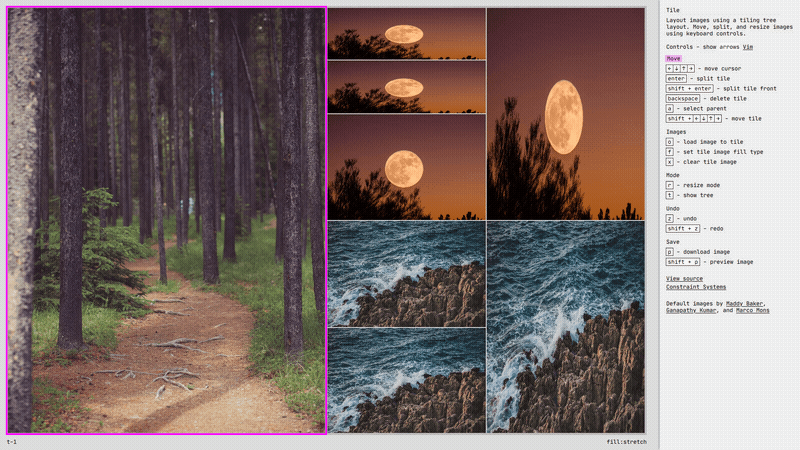
Most of the decisions I made could apply to either a tiling window manager or a tiling image assembler. But some things are specific to Tile because it deals with images. One late change that made Tile more interesting, was copying the image when a tile is split. This decision creates a forking, multiplying effect as you split tiles that is fun and interesting. It wouldn’t apply in a window manager because there you generally choose the application as you open the new space.
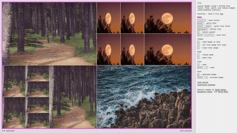
Image fill types include: stretch, contain, and cover.
Another image specific decision was deciding on the default image fill-type. The default image fill-type is stretch, where the image is stretched over the dimensions of the tile. Stretch does not respect the image’s original aspect ratio. The other two fills, contain and cover, do. Stretch is probably an unusual default choice, because it distorts the original image, but I thought it was the most interesting.
Where to next
Tile was an opportunity for me to explore tiling layout logic, something I plan to continue to experiment with. A lot of the Constraint Systems experiments work from the “inside-out” with a cursor inside of a grid. Tiling gives me another method of navigating and partitioning space, either to explore on its own or in combination with the grid-cursor. I’d like to continue to refine the code logic for the tile layout and movement, hopefully condensing it down into something that I can drop in across projects.