CSS: end-user styling possibilities
I’m excited about CSS again. After experimenting with making layout-from-scratch apps with WebGL/Three.js in an attempt to avoid the sprawl (and creating my own mini-sprawl in the process) I’m rethinking approaches.
I’m interested in making applications where users customize with their own CSS. My bet is that if we get the initial primitives right, this could allow users to truly customize and feel at home in their spaces.
Benefits
What do you get from letting users directly write CSS in the application:
- Styles are instantly applied.
- You don’t need to worry about performance (in most cases).
- The application is transparent – you can copy copy and paste or change selectors to apply from one section to another.
Learning CSS
Most people don’t know CSS, and it is not intuitive to get started with. It does have some things going for it in this regard, though:
- It’s tinkerable. Particularly if you start the app with a template and show all the styles applied, you set people up to start changing things and observing the changes, my favorite way of learning.
- The documentation is out there. The web is full of great guides (CSS-Tricks, Josh Comeau) on how to use and think about CSS. Compare this to trying to set up your own customization system for you app, which you then have to explain and support for your users.
- The skills transfer. Learning CSS can be a springboard into web dev. It was for me with Tumblr and WordPress. It can be for many others.
CSS.gui
A super interesting recent development here is CSS GUI by Components AI. Their goal is to provide a GUI for editing all CSS properties. What I love about this is how closely it maps to CSS – it’s quite possibly the missing step in a ramp from no styling to custom CSS.
Complexity trade-offs
Because it needs to stick to the CSS spec, the GUI for CSS.gui is often going to be a little more verbose than an app like Figma’s might be. But I think the trade-off, where you’re actually manipulating the CSS itself, is worth it in a lot of cases. Figma styling (and before that photoshop and illustrator) has it’s own quirks, born out of edge-case handling, that designers learn to navigate. They handle these quirks to make their design, then they hand-off to engineers who handle web quirks to make that design happen. But what if both were aligned from the start on working within the same set of quirks… I’m fascinated by the idea of the web as a material, and a GUI working off CSS feels closer to working with the material directly.
The importance of structure
How much true customization a user can do with CSS, and how easy it is for them to do it, is dependent on how the app is structured. This is a design challenge I’m currently interested in. I would break it down into these related parts:
- Structure of the app. Cleaner structure (fewer nested divs) will make applied CSS properties much easier to read about.
- Classnames and Ids. You want to give people intuitive selectors to hook into. You also want to expose them to people – you can lean on developer tools to an extent, but it would be nice to be even more upfront about it.
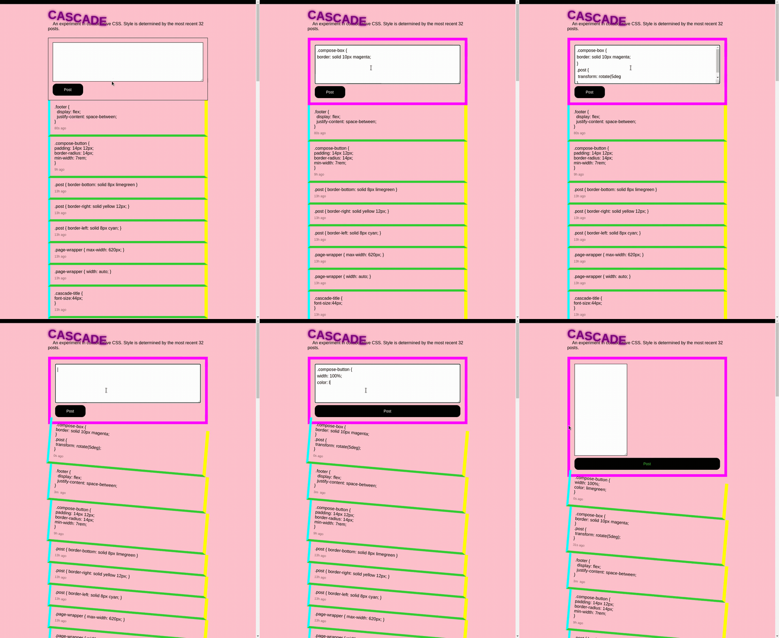
This is something I’ve been playing with in things like Cascade. It’s more art than science, and there could be lots of different approaches that might resonate more depending on the app and the user. I like that this part is something like a partnership with the users. It becomes more about providing the user the right toolset.
Special challenges: position and size
A big challenge is the fuzzy line between style and functionality. I see this come up the most with position and size. It is my current take that position and size should mainly be controlled by the application (not through CSS customization) and that this should be directly manipulatable. Something like a box model where you can move and resize the boxes through direct manipulation. There is overlap there, a lot of CSS properties can affect size and position and they may collide in unituitive ways. This is one of the main challenges I’ve been exploring and I don’t think I’ve cracked it yet.
Some strategies:
- Make the styles applied transparent, and even toggle-able, so if there is a collision the user can reason about it and decide how they want to handle it
- Determine size based on content, a lot of the experiments I’ve done have been using text-boxes, if you calculate their size based off content, you can apply styles like font size and border size in a way that feels ‘reasonable’ to the user.
I’m sure there are more strategies, this seems like the thorniest and most interesting part of the design challenge to me.
Inspiration and experiments

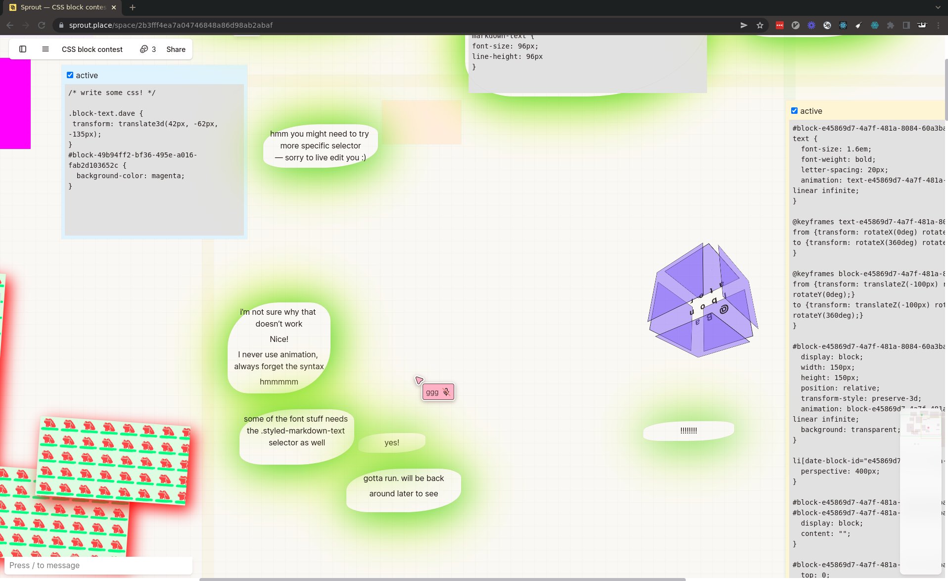
- Our CSS block in Sprout and the creative uses people have put it to is a huge inspiration.

- My Cascade experiment in collaborative CSS reinforced my belief in the creative potential of it. It was also an interesting experiment in providing a structure for people to modify.

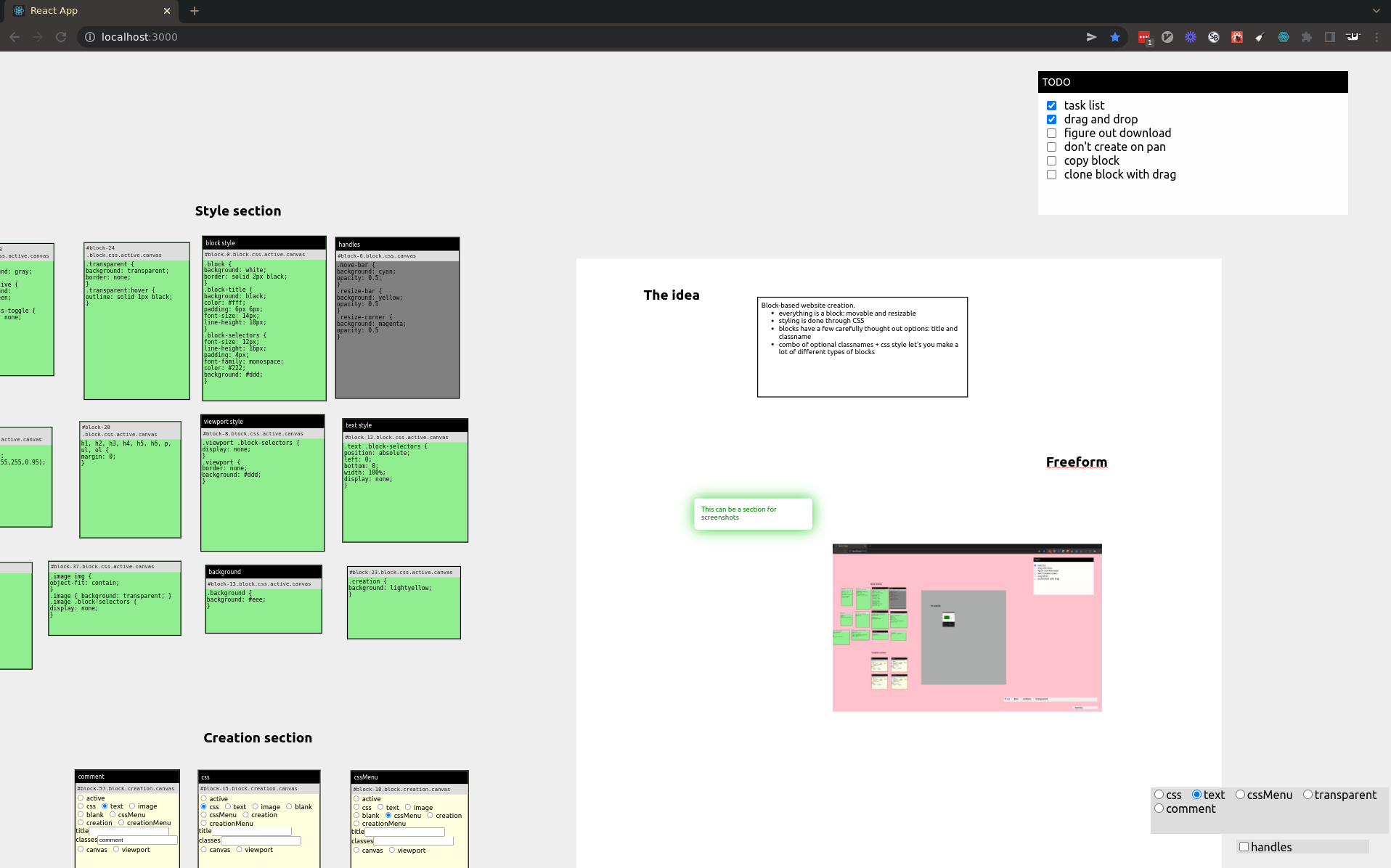
- I’ve been experimenting with an even more customizable block-based model, where all styling is applied through CSS blocks. It also features a zoomable infinite canvas, which is partly a solution to how to keep all of this info approachable without it taking over the app. These experiments solidified my belief that CSS can provide really rich customization experiences. It also got very sprawling, so I am now trying to scope it back down and explore some of these ideas in isolation.

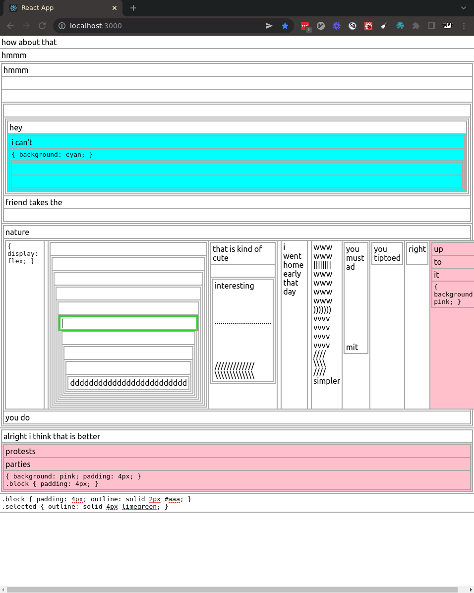
- To try and scope things down from the freeform editor, I’ve been experimenting with something more list-based. This is something like an outline editor (Workflowy, Roam) with customizable, scoped CSS blocks for each nesting. It’s promising but also getting pretty sprawling once again. The interaction between layout and CSS is once again the thorniest part… but really interesting to try and work through.